A clean Norse animal ornament is neither an accident nor generic "Viking scribble". Behind it stand six clearly distinguishable art styles spanning some three hundred years – each with its own key finds, its own sense of form and its own rules. Know them, and you no longer draw something vaguely tangled: you draw a ribbon-animal that belongs to its age. Here you get both – an overview of the styles with their diagnostic features and a practical guide to building a plaited beast from scratch, so that it also holds up as an engraving.
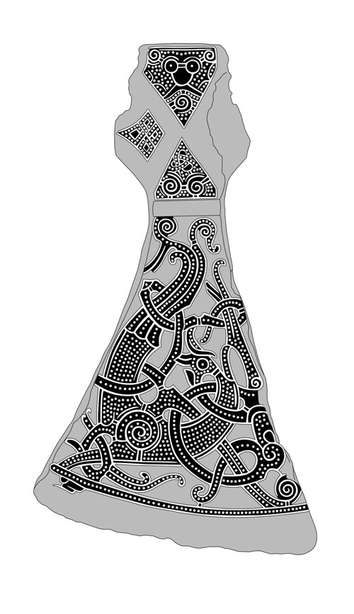
The heart of Viking-age art is the animal – not the abstract pattern. What looks from a distance like pure interlace is, on closer inspection, almost always a body: a head with eye and jaw, a ribbon-like trunk, hips, legs, gripping paws. The knots are limbs and neighbouring beasts that wind around, clutch and bite one another. That is exactly what separates Norse animal style from every other kind of interlace: it always tells of creatures, never of empty geometry.
Across the Viking Age, six styles succeed one another, and they do so with remarkable discipline. A buckle, a pendant or a rune-stone can often be dated by its formal language alone. For us in the workshop that means: whoever engraves a motif should choose one style and hold to it. A gripping beast beside a Ringerike tendril is like mixing Gothic script with a smartphone emoji – technically possible, but it simply does not belong together.
Evidence: The sequence of styles is no modern invention but rests on datable key finds: the Oseberg ship burial (chamber dated dendrochronologically to 834), Gorm's silver cup from Jelling (north mound, ~958/59), the Mammen axe from Bjerringhøj (~970s), the Vang stone and the gilded weather-vanes of Heggen and Källunge, and the north portal of Urnes stave church (~1070). It was on these anchor pieces that art historians such as Wilson and Klindt-Jensen built the chronology.
Before it becomes "Viking-age", there are the Germanic animal styles of the Migration Period. The Swedish scholar Bernhard Salin ordered them around 1904 into his famous stages. Salin Style I (c. 5th–6th century) breaks the animal into separate limbs scattered across the surface – you almost have to hunt for the body parts. Salin Style II (c. 6th–7th century) draws those limbs out into long, smooth, interlacing ribbons; here, for the first time, appears the calm, seemingly endless plaited beast that later defines Viking art. Anyone who wants to understand the Viking styles should treat Salin II as their grandfather: the ribbon-animal is born, and the Vikings simply keep rebuilding it.
1. Oseberg (Broa), c. 800–875. The overture. Its hallmark is the gripping beast: a small creature with a rounded head, large staring almond eyes and paws that clutch everything – the frame, its own limbs, the neighbouring animal. The surface is dense, restless, completely filled and symmetrically interlocked. Key finds: the Oseberg animal-head posts and the Broa bridle mounts from Gotland.
2. Borre, c. 850–950. The only style with the famous ring-chain: a double-strand plait whose rings appear bound at the crossings, producing circles and lozenges. With it comes a gripping beast with a triangular, cat-like mask head, round ears and bulging eyes. Strictly symmetrical, geometric, usually in cast gilt bronze.
3. Jelling, c. 900–975. Slender and elegant. Here S-shaped ribbon animals interlace in symmetrical pairs, double-contoured, with a fine beaded or niello median line running through the body. The heads are shown strictly in profile, the jaw open, with a curling upper lip and a single spiralling neck-tendril. No more gripping beast. Type object: Gorm's silver cup.
4. Mammen, c. 950–1025. Now the animal turns fleshy. A single great beast, double-contoured, its body densely filled with pellets (dots), with spiral hips and a lip lappet. From head and tail grow, for the first time, short curling tendrils – the first botanical note in Norse art. Type object: the silver-inlaid Mammen axe.
5. Ringerike, c. 1000–1050. The great beast remains (lion-like, striding, double-contoured, almond eye), but is now wreathed in long, thin, tapering plant tendrils that spring from paired shell-spirals, cross one another and curl into pointed lobed leaf-tips. Open, dynamic, balanced. Key finds: the Vang stone and the weather-vanes of Heggen, Källunge and Söderala.
6. Urnes, c. 1050–1125. The last and most elegant style. A single slender, greyhound-like great beast with a looping body and thread-thin legs fights one or more very thin serpents, all woven into open figure-of-eight loops. The lines swell and taper (thick–thin), the surface is barely filled, the composition asymmetrical. Type object: the north portal of Urnes stave church.
Five rules of thumb are enough to place almost any genuine ornament:
You do not need much: a soft pencil (HB and 2B), an eraser, thin tracing or grid paper and a fine liner for inking. Working digitally, use one layer for the grid, one for the pencil build-up and one for the clean line. The principle is the same either way: structure first, then the animal, and only last the clean line.
The single most important principle up front: a ribbon-animal is one continuous band that swells at certain points into a head, a hip and a foot. It is not a heap of separate strokes but one body winding through the surface. Keep that in mind and every crossing becomes logical.
A few habits make the difference between "tangled" and "stylistically pure":
"From Odin's mouth it went out, to the Aesir first, then to the elves, some to the Vanir, some to men." Hávamál, stanza 143 (translation Henry Adams Bellows, 1923; public domain) – on the runes, the sister-craft of carving and incising.
The six styles are no mere whim of fashion but a coherent development. At the start (Oseberg, Borre) stands the urge to fill the surface completely: the gripping beast packs itself into every corner, nothing stays empty, everything interlocks. With Jelling a calming sets in – the crowded swarm becomes two elegant ribbon-animals, clearly legible and elongated. Mammen then brings flesh and the first plant into play: the animal gains volume, the pellet filling gives it texture, and from the tail the first tendril curls. Ringerike drives exactly that tendril to a grand scale: long, thin stems that play around the beast like a wreath of leaves. And Urnes, finally, reduces everything back to essentials – a slender animal, thin serpents, open loops, plenty of air. So over three centuries Norse art swings once from the dense to the empty, from the interlocked to the flowing.
For practice this is more than art history: it tells you which sense of form you must hit. An Oseberg or Borre motif may feel "too much"; an Urnes motif lives from leaving out. Fill an Urnes beast with Oseberg density and you have missed the spirit of the style, even if every single line looks "Norse".
Most failed ornaments founder on the same three points. First: it is not an animal at all. Start straight in and interlace bands, and you end up with the Celtic endless knot – lovely, but wrong. Fix: always begin with the route and set head, hip and foot deliberately before you plait. Second: the over-under sequence is off. As soon as one band lies over twice in a row, the illusion collapses and the eye sees only strokes. Fix: check each crossing individually and, if needed, mark "O" and "U" in light pencil. Third: styles get mixed. A pellet body with long Ringerike tendrils and a Borre ring-chain may look "rich", but it is a time-travel accident. Fix: settle on one style before the first stroke and keep the feature list beside you.
A fourth, subtler error concerns the proportion of the head. The head is the anchor by which the eye recognises the animal. Too small, and the ornament looks headless and abstract; too large, and the flow of the band breaks. Draw the head early, check it against the band width, and let eye, jaw and – from Jelling on – the lip lappet sit clearly. A clean head forgives many small imperfections in the interlace; a botched head makes even the most perfect band worthless.
Myth-check: The Celtic endless knot is not a Viking design. Insular and Norse art influenced one another, but the Celtic knot is an abstract, geometric endless band without an animal – Norse ornament, by contrast, almost always consists of animal bodies with head, eye and gripping foot. Selling "Celtic knots" as "Viking" mixes two separate traditions. Likewise, Vegvísir, Ægishjálmur and the "Web of Wyrd" have no place in genuine animal style: these are Icelandic magical signs from manuscripts of the 16th to 19th centuries, or modern inventions – not Viking-age ornament. And the most common error of all: do not mix the styles. Each style is an epoch. A Borre gripping beast beside a Ringerike tendril, or an Urnes figure-of-eight with Mammen pellet filling, does not make a "particularly Norse" motif but one that never historically existed. One motif, one style – that is the iron rule.
For engraving, clear, bold single-colour line art works best – conceived as clean black on white, with confident strokes and no grey gradients. That matches the origin of the models: wood carving, silver inlay, bronze casting, stone. These materials live from the clear line and from relief, not from soft shadow. A stylistically pure ribbon-animal, cleanly plaited and thought through for its material, therefore transfers beautifully onto slate, wood or glass.
If you want to go deeper into the individual styles and their world of finds: see our articles on the Oseberg ship, the Urnes portal and the overview of Viking art styles. And if you would like your own motif engraved, our custom engraving is the way from sketch to finished piece.
Viking-age art styles · The Oseberg ship & the two women · The Urnes portal – the last animal style.
Slender animals and serpents winding around one another in endless, elegant loops, as fine as if drawn with a pen: this …
Read more →Three interlocking triangles, an eight-armed magical stave, a “wayfinder” – few areas are as full of beautiful …
Read more →